Welcome to the whimsical world of user behavior! In our journey through various websites, we’ve discovered that users are a fascinating breed – they’re actionably strange, and we mean that in the best way possible. Let’s embark on a journey to explore these curious patterns and what they mean for your user experience.
Clicking on Instinct: The Curious Case of Misleading Clicks
You’d think in this digital age everyone would have a handle on what’s clickable, right? Think again! Many users are still playing a guessing game. They often click on anything that catches their eye, like bold text with a keyword. It’s not about logic; it’s about what intrigues them.
The Singaporean Restaurant Directory Saga
Now, let’s take a peek at a real-world puzzle: a restaurant directory website in Singapore struggling with high advertiser churn rates. Picture this – decent traffic but the listings aren’t getting enough love, resulting in frustrated advertisers.
The Bold Text Phenomenon: When Paragraphs Become Click Magnets
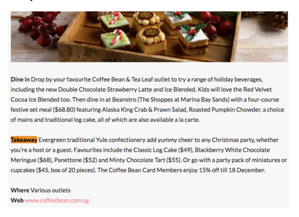
Our reports unveiled something quirky. Users were bypassing the actual URLs and clicking on bolded calls-to-action like “Takeaway” and “Dine in.”
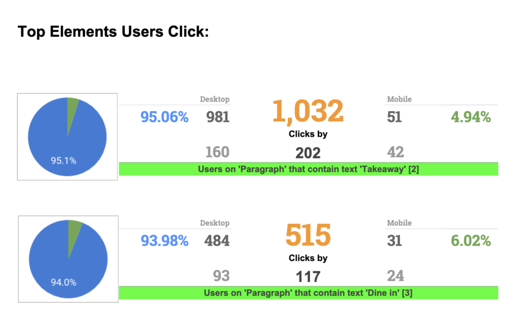
After checking out the real deal, here’s the scoop on our website’s listings: picture a catchy banner, a snappy paragraph with the word ‘Takeaway’ in bold, and right there, a URL linking to the advertiser’s site.
Who would’ve thought? The simple fix? We hyperlinked these enticing texts and voilà – a threefold increase in traffic to the advertisers’ sites. Sometimes, the best solutions are the ones hiding in plain sight.
Finding the Magic Word: ‘Takeaway’
Alright, let’s talk about the magic in the word ‘Takeaway’. It’s like finding the secret password in a spy movie. Users are on a mission, and ‘Takeaway’ is their target. When we switch things up and make our links shout out what they’re really about, like ‘Dine in or Takeaway’ instead of ‘Read more’ or ‘Learn more’, guess what? Users start clicking on those URLs like there’s no tomorrow.
This isn’t rocket science; it’s just giving users what they want, plain and simple. Make it clear, make it fun, and watch them click away happily.
Conclusion: Embracing the Unpredictable in UX
In the topsy-turvy world of user experience, the unexpected becomes the norm. This journey through user behavior teaches us one crucial lesson: understanding and adapting to these peculiarities is key. By embracing the unpredictable, we can turn UX challenges into opportunities. So, keep your eyes open and be ready to think outside the box – your users will thank you for it!