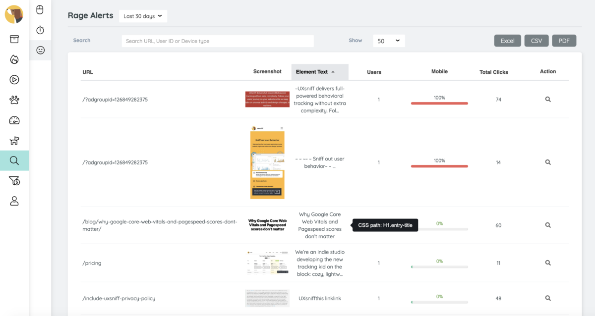
Looking back on 2019, we have a feature called rage alerts. It basically just a rage click tracking algorithm by monitoring every single element users are clicking. Rage alert will be triggered if a user clicked more than X times on a single element.
The X is the rage click threshold where the user can set in the account preferences. By default the rage click threshold was set to “30”. It’s not common that a user will click on a single element more than 30 times in a single session, but still there are exception such as a “load more” button.
However, we’ve received some feedback while tracking those rage clicks. The rage click tracking insights are great, but the only issue is the way to identify those elements.
Imagine one day we would tell you that your website users were clicking 500 times on an element. The next questions you would be asking:
“Where does this happen?”
“What they click?”
It’s easy to tell where does the rage click happens, say your homepage. But it’s hard to illustrate what they click. We have been trying to tell some clues about the element and you have to figure it out. No matter how hard we try to illustrate the element, our users might still need to spend extra time to decipher it. For example:
“It’s a button”
“It’s a paragraph”
“It contains text: Register”
“Its CSS path: header > .menu > a:nth-child(2)”
Finally, we are able to show you the screenshots of the elements and it’s available for all plans. However, there are some known limitations such as:
- screenshot a password protected directory/page
- screenshot elements that are hidden from the DOM or dynamically loaded.
Other than that, the screenshot would works most of the time. Feel free to login to your account and access the rage alerts at Watchdog or Reports > Rage alerts
