User behaviour is interesting and funny
Users are puzzling, surprising, and oftentimes, plain funny. Dive deep enough into their behaviour, and you’ll rethink everything you know about user experience.
Did you know?
A good chunk of online users still can’t differentiate between what is clickable and what is not. They’ll just click on anything that seems interesting to them, such as a bold text with a keyword.
Case study
A local portal for businesses, designed a directory page dedicated to advertisers. However the users weren’t interacting with any of them. That upsets the advertisers.. Ending-the-relationship-for-good upset.
We took a look into the website UX, they have very cool web design, good copywriting, everything looks good.
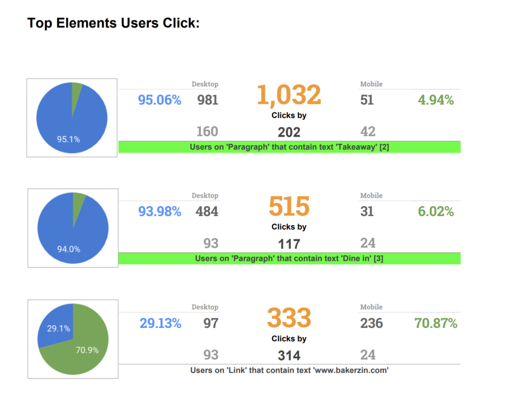
We found some user activities that raised a question. Why would most of the users clicking on paragraphs?

Well, it ends up the users are clicking on the bold keyword “Dine in” Instead of the advertiser link below.

Same goes for “takeaway”

Rethink user behaviour
This case study means a lot to us. The first web page went live on August 6, 1991. We thought that online users today should be able to differentiate between what is clickable and what is not. In fact not at all.
Should you review your actual user behaviour and check whether it matches your initial UX designs and expectations?
