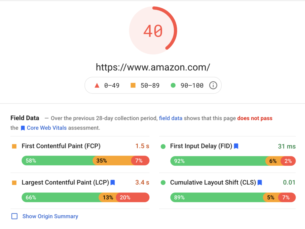
Google has delayed the rollout of page experience update. The update will be rollout between June and August 2021, gradually. You probably aware that the update will include Core Web Vitals signals into search engine ranking algorithm. At this point, you might thinking of running a test on Google pagespeed. You might as well implement all the suggestions hoping to take advantages of the upcoming update.
No, you shouldn’t listen to these test results, if you don’t know what you’re doing!
Since early May, my friends and colleagues started poking me for help regarding their Core Web Vitals test results. Some of them are actually being directed by their managers or admins. I am writing this guide to avoid answering the same doubts over and over.
Anyone can simply enter a URL and get the score from Google Pagespeed. (most of the time you will get a red or yellow badge with a list of suggestions). The worst thing to do is blindly follow and implement all the suggestions. The second worst thing to do is sending the test result to your developers and asking them to ‘fix’ it.
Overall, Core Web Vitals is a great guideline to follow in order to achieve a better UX. (If you do it correctly.) According to Google:
If page load time increases from 1 second to 3 seconds, bounce rate increases 32%. If page load time increases from 1 second to 6 seconds, bounce rate increases by 106%.
Core Web Vitals Report
Back to the Core Web Vitals, there is something you should keep in mind. The fundamental goal of the Web Vitals is to deliver a better UX, not a better search engine ranking.
Now, let’s take a closer look into the 3 Core Web Vitals, LCP, FID and CLS.

Large Contentful Paint (LCP)
LCP is about your page loading performance, NOT about the regular page loading speed.
What’s the different here? Let’s take above the fold optimisation for example, it’s common to keep the most important content above the fold. So, people start having animations, video backgrounds above the fold in order to get attention.
Unfortunately, all those will take some time to load. The above-fold was the largest empty space and it’s the last thing to complete the load. Poor LCP score in this case.
LCP suggests that you should fill the largest content as soon as possible. This including:
- Show the text before the custom font was loaded, be it some font flickering. Most of the modern browser tend to display custom font after loading for a ‘smooth’ experience but Google wants it another way round for the sake of good UX. Simply set your custom font css: font-display to ‘fallback’ will do the trick.
- Split the CSS into critical and non-critical, load the critical CSS inside head and move the non-critical outside the head. Be it some font flickering, shadow and fancy CSS effects switching before and after. Use this critical path css generator to generate your critical css, paste the critical css inside your HTML HEAD section and move your original css outside the HEAD. This will give you a big boost in LCP.
So, should you follow these LCP suggestions?
It’s depending on the industry you are coming from as well as your audience. If you are from a design-centric industry, you will probably find these suggestions against your design principles.
You shouldn’t follow if you believe visually flickering is more of a UX killer compare with slightly extra loading time. You should keep your anti flickering approach, preload things before showing to your users.
Otherwise, follow the suggestions if you are not from a design-centric industry.
Usually, when the CTO was celebrating for a all green Core Web Vitals scores, the design head would be stomping for the font/css flickering. He/she will even suggests a loading spinner for a smoother loading transition.
Eventually, it will depends on the person who’s making the final call. Whether he/she more appreciates a fast loading website or a smooth and fancy loading experience. Usually, the technical head will win if provided the pros and cons as well as SEO tradeoffs of the implementations.
First Input Delay (FID)
FID is about the interactivity of your page. Unless you are running some heavy JavaScript applications, you should see a green FID score.
In some cases, you might want to ignore the high FID cause by some intentional input delays.
For instance, you might need a JavaScripts OnClick PreventDefault function to send important tracking signals before firing the click event. This will introduce high FID but that’s the tradeoff of this approach.
Cumulative Layout Shift (CLS)
CLS is about the visual stability of your page. You should minimise unnecessary layout shift to prevent user from clicking on the wrong element.
Unless you have a Awwwards winning UI that shifting layout, you should see a green CLS score.
If you are monetising your website by displaying ads, you will find a poor CLS score. Since most of the responsive ad unit including Google Adsense does shift the layout, CLS pretty much telling you to remove all your responsive ad unit in order to have a good UX. So, the choice is yours.
Core Web Vitals Warnings that you should consider to fix
- Uncompressed Images – Optimising your image should dramatically improve your overall Web Vitals Score.
- Minify CSS – Yes, you should always minify your CSS.
- Image elements do not have explicit width and height – You should fix this as it will introduce unnecessary layout shift that will hurt your CLS
- Some third-party resources can be lazy loaded with a facade – Yes, you don’t need to load some third-party resources in the head. Move facebook, twitter, youtube and hubspot plugins resources outside the head would help to improve your overall loading performance.
Core Web Vitals Warnings that you should think twice before fix it
- Ensure text remains visible during webfont load – Yes and no depending whether you are from a design-centric industry.
- Eliminate render-blocking resources – Yes and no, similar to the above, it depends what you want your users to see within the acceptable tradeoff of the loading performance.
- Properly size images – Yes and no. You can use 3x large images to serve retina sharp images on mobile, or use a low resolution image on mobile for a faster loading performance. (You can use srcset to serve responsive images on mobile and desktop)
- Remove unused JavaScript – you will find most of the third party Javascript (twitter, youtube, hubspot etc) had been flagged as unused. It’s fine to ignore these warnings.
- Defer offscreen images – Pagespeed will suggest to use a lazy image load to improve this. Please keep in mind that a lazy load can hurt E-commerce UX when visitors fast-scrolling.
- Serve images in next-gen formats – WebP has as 94.4% of browser compatible as of today. But converting all your current images into WebP is a risk. Keeping both original images and WebP would be expensive (Especially if you are on on-demand cloud). Why not let the CDN do the job? Most of the CDN provider has WebP image optimisation option now.
Last but not lease, the eye test
You hear me right, sometime your own eyes work even better from a UX point of view. Don’t be obsessed about the “score” from the test results. You are usually fine if your website visually loads fast.
Tell me which one is more pleasant to your eyes? A page with 2 seconds faster loading with flickering images and texts on-load, or a page with 2 seconds slower loading with custom fonts and images ready plus a css ease-in effect?
Lastly, I hope you guys have a better understanding on the Core Web Vitals signals after reading this, and less panic while looking at some scary warning messages on the test results.
